More on the MIT Report on Proposed Assingment Plans
Addthis
I've had some more time to look at the MIT report on the three proposed student assignment plans. Here are some additional thoughts.
The report looks at how the plans would affect socio-economic and racial diversity in schools. In all cases, the new plans would reduce diversity somewhat. This is likely because they limit families' choices to smaller geographic areas. Given the smaller areas and the fact that none of these plans is specifically designed to promote diversity, it's not surprising that they reduce it.
None of the changes are huge, but the reduction of socio-economic diversity seems significant. The way to look at this is to look at the variance in percentages of students of various groups among the different schools. MIT is using the standard deviations to measure this variance. The lower the standard deviation, the less variance and thus more diversity there is. Under the current plan, the standard deviation for kids receiving free or reduced price lunch is 9%. In the new plans it ranges from 11.1 to 11.3%.
An easier way to understand the differences is to look at some of the variance graphically: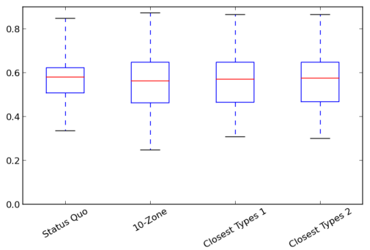
The box-plot style graph above is used throughout the report to represent the distribution of students under the various plans. The number on the left in this case is the percentage of students in a school who quality for free or reduced price lunch (e. g., 0.6 represents 60% of students). Note that MIT did not have free/reduced price lunch status and is only looking at assignment round 1, which explains why the percentages are lower than the district overall. The red lines are the median value, half of schools are above the line, half below. The boxes represent the 25th - 75th percentiles. The dotted lines represent the entire range of schools, so the short, horizontal line below each box is the minimum percentage under that plan, while the horizontal lines above the box represent the maximum percentage. A smaller range between the top and bottom values means more diversity. While we would like to see the entire range be as small as possible, it might be more useful to look at the boxes because this will filter out any outliers. The smaller the box, the better diversity we have.
It's easy to see from this chart that the current plan better achieves socio-economic diversity than the three proposed plans (Closest Types 1 & 2 are Peng's names for what BPS calls Home-Based A&B). Among the three proposed plans, Home-Based B does best, but the differences among the proposed plans are minimal.
The impact of the plans on ethnic and racial diversity is somewhat smaller than on socio-economic diversity. You can see those charts in the graphical appendix to the report which has quite a bit of additional analysis of the proposed plans, plus analysis of K1 and the original BPS proposals. Among the new plans, there's really not a clear winner as far as diversity. It appears that the 10 zone plan is the worst and the Home-Based A is the best, but the difference is very small.
Another measurement in the report is the number of nearby children who will be in the same grade at the same school as the average child. The report looks at the average number of students who live within 1/2 mile of each student and will be in his or her grade and school under each plan. The three proposed plans would increase this number by 25-30%. The raw numbers look quite small. Under the current plan, the average (median) student can expect to have around 3 neighbors in his or her class. Under Home-Based A it would be around 4 neighbors. However, this is just kids assigned in the first round in the same grade. There would likely be many more neighbors in each school, so the 25-30% increase would be noticeable.
The report also has several maps of Boston showing how several measurements look when plotted on a map. I was particularly interested to see the maps on effective access to quality. One thing that really raised equity concerns about the current system were maps that showed that kids in the East zone tend to attend much worse schools on average and that this inequity spills over into low-income neighborhoods in the West zone as well. I created a map that shows that the problem persists even when using the MCAS snapshot measurement which takes into account some of the improvements made to quality in recent years. One interesting thing about the maps in this report is that they don't look anywhere near as bad. Here's the map of effective access to quality under the current plan:
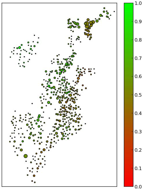
In this map the brightest green at the top of the scale on the right would indicate a 100% chance of the average child at that geocode getting a quality seat while the brightest red at the bottom of the scale indicates that kids in that geocode would have no chance of getting a quality seat. You can see that there are variations from geocode to geocode, but it looks very subtle, especially compared to the map I created. Why the difference? I think there are actually several reasons. One is just the way the maps are colored. I set the lowest actual value to bright red and the highest to bright green. This map sets the lowest and highest possible values to the brightest colors. I don't believe that there are any geocodes with zero access to quality, though there may be some with 100%. This makes the color differences less obvious. More important is that the maps are showing two different things. This map shows effective access to quality for kids applying in round 1. My map shows actual attendance. One difference is that this map includes kids who may have decided to opt-out of BPS altogether after getting their assignment. This could account for some of the difference.
I suspect that a larger factor could be that this only shows round 1 data. Peng had previously determined that kids who apply after round 1 are more likely to get assigned to a school with low MCAS scores. It seems likely that kids who apply after round 1 are not evenly distributed around the city, so removing them may make those parts of the city look like they're doing better under the current plan than they are in practice.
A final factor is that this shows what Peng is calling effective access to quality. This means it's looking at a family's chance of getting a quality seat assuming that they rank quality seats above non-quality seats. I think that this is a fair measure of access to quality because it doesn't make sense to say that a plan doesn't offer quality (as measured by MCAS scores) to a family that is valuing other factors and ranking schools we define as "non-quality" higher. However, it does mean that if certain areas have a larger percentage of parents who don't rank quality schools highly, those neighborhoods will show a larger difference between what's seen in this map and what's seen in actual enrollment.
Still, this map should be useful for comparing the three new plans to the current plan. As an example, here's the map for Home-Based plan A:
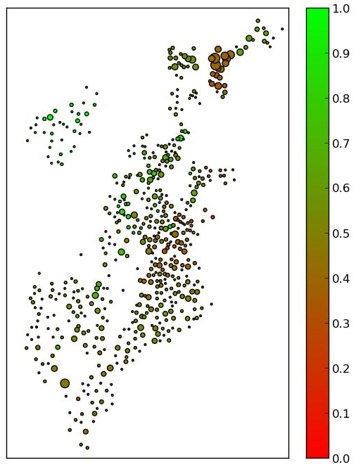
It's hard for me to tell from this which plan is better and by how much. I would say that the current plan is actually better as far as being geographically equitable even though it appears to be worse overall.
I think this is at least as long as any blog post should be, so I'll stop here for now. Expect more on this report later this weekend.
If you have any questions on these plans or the report, please post them in the comments and I'll do my best to answer them.
Comments
Access to quality and close to home were the primary goals
This needs some context.
The primary goals of the EAC have been to improve access to quality and reduce transportation / achieve closer to home schools. So that's been the real focus of discussion. That is, the last thing you discuss is the more important topic to the EAC.
Socioeconomic diversity, the first item you discuss, is not a primary goal, though the EAC skirted actually saying that out loud. The main reason was articulated at one of the meetings: it's very difficult to achieve given the current BPS population. Here are some stats:
http://www.bostonpublicschools.org/files/bps_at_a_glance_12-0419_0.pdf
FInally, those maps need to be re-done so they are understandable. They need the outline of the city, for starters. Also, while perhaps they didn't want to use extremes of color as it would seem to overstate the differences, they do need to make them legible.
What are the goals of the EAC?
There have been lots of talk about what are and aren't the goals of the EAC. Here's what it says on the Boston School Choice website:
"Every student in the City of Boston deserves to attend a high-quality school that meets his or her needs and is as close to home as possible. To realize this goal, the Mayor and Superintendent of the Boston Public Schools have appointed the independent External Advisory Committee on Improving School Choice (EAC). "
I had read this before but I hadn't really noticed that it really implies that ensuring that every child attends a high-quality school is very much a part of the EAC's goals. Which means that quite a bit of what they've declared to be not part of their purview is really very much in their purview. I just thought this was interesting. Close to home seems to be less important, since it's second and qualified with "as possible."
Some members of the committee have definitely expressed concern about socio-economic diversity and they did ask that this be considered in the evaluations. I'm interested in the number from the PDF you linked to. The state has the number of free and reduced price lunch students at only 69.5% (http://bostonschoolchoice.org/external-advisory-committee/eacs-mission-s…) which is also closer to the number in the data BPS released for last year. But no matter what the number, there percentages differ from school to school and I'd hate to see a plan that concentrated low income students more than they already are.
I agree with you on the maps, it's hard to get much out of them. There are neighborhood-by-neighborhood charts in the graphical appendix which might be more useful.
Add new comment