A Potential Problem with BPS's Quality Measurement
Addthis
As discussed in a previous post on measuring quality, BPS is currently using only MCAS scores to measure the quality of schools when evaluating potential new student assignment plans. They're calling the measure they're using a quadrant analysis. For each MCAS test BPS looks at two measures. One is a performance measure based on the percent of students who fell into the "advanced" or "proficient" categories. The other is a growth measure using the Student Growth Percentile (SGP) calculated by the state. SGP measures how much each student "grew" academically relative to other students in the state. This is an important measurement because it captures what the student actually learned in a year. This measurement levels the playing field somewhat as far as demographics because SGP is based on how much each student learned during the year rather than largely measuring what the student already knew.
Using these two measures, BPS puts each school in one of four quadrants on a chart (see the "quadrant analysis" link above for the 2012 charts). Schools with above average performance are placed on the right-hand half of the chart. Schools with above average student growth are on the top half. So the higher and farther to the right a school is on the chart, the better it's doing.
BPS then assigns a number to each school. Schools in the upper-right quadrant get a one. Schools in the lower-left get a three. Schools in the other two quadrants get a two. Lower scores indicate higher quality. This yields four numbers from one to three. One for each MCAS test used (English Language Arts and Math) for each year included (2011 and 2012). These four numbers are averaged to create the single number that is being used to measure quality.
The problem is that the while the two measurements used to place schools in quadrants can vary widely, BPS is boiling them down to two values: above average or below average. This means that there's no distinction between an exceptional school and one that is slightly above average on a particular measurement. Also, there can be a very large distinction between a slightly above average school and a slightly below average school. This can cause distortions and make it hard to rank schools accurately or measure relative difference in quality among schools.
As an example, the image below shows three schools that were included in the quadrant analysis. The y-axis is the student growth percentile. The x-axis is the percentage of students scoring proficient or advanced. The four dots for each school represent their Math and English scores for 2011 and 2012. Keep in mind that dots farther to the right and closer to the top of the chart indicate better scores. Take a look and see which schools you think are better.
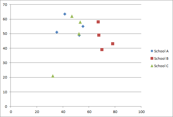
School A is the Curley which is the 5th ranked school based on the quadrant analysis. School B is the Kilmer, ranked 28th, and School C is the Sarah Greenwood, ranked 10th. Why does the Kilmer rank so much lower? Two of its scores rank a little below average for student growth, but its over-all performance is excellent. Notice that the Kilmer's worst performance ranking (percent of students scoring proficient or advanced) is much better than the best rankings for the other two schools. But the other schools are still mostly above average so Kilmer gets no credit for this difference.
The problem is exacerbated in the latest BPS analysis. This is because the analysis designates all schools as either a quality school or non-quality school. This means that even a small change in a school's ranking can move it from one category to the other.
A better way to create the quality ranking from the same raw data would be to take each of the numbers that goes into the current rating and calculate how many standard deviations above or below the mean it falls. These numbers could be averaged to create a single score for each school. This score would still be measuring the same growth and performance factors relative to the district average. But it would also make a distinction between small differences and large ones, without having any artificial breakpoints.
Also, BPS shouldn't try to choose an arbitrary point to designate a school as being a quality school. No matter what point they choose, it will result in schools that are essentially of the same quality being split. Instead, the analysis should look at the weighted probability of getting into a higher or lower quality school. For example, if a student has a 40% chance of getting into a school rated 1.0 and a 60% chance of getting into a school rated 3.0, that students weighted probability would be 2.2, calculated as follows: (0.4 x 1.0) + (0.6 x 3.0). This measure will allow us to see differences in access to quality without making arbitrary distinctions.
Comments
Lots of problems with MCAS
I agree that the way that the BPS has used this data to lump these schools into two groups is ridiculous, but honestly, I think any analysis that only looks at overall MCAS results is going to be seriously flawed.
Let's look at the three schools you listed. The Greenwood has 189 students. 112 of those students are ELL or former ELL, 142 are low income, 48 are students with disabilities, and 171 are high needs. The Curley has 488 students, of whom 235 are ELL or former ELL, 385 are low income, 138 have disabilities, and 409 are high needs. The Kilmer has 246 students; 38 are ELL or former ELL, 81 are low income, 44 have disabilities, and 119 are high needs. There is no way that the overall MCAS score comparison among these three schools is anything like apples to apples. Is it really a surprise that the Kilmer Schools ELA scores blow away the Greenwood's, given that only 15% of Kilmer students are ELL vs. 59% at the Greenwood?
In general, I find it much more enlightening to look at MCAS subgroup data than overall results. Even then, you can only tell so much about how the school is doing - categories like low income or students with disabilities capture a wide range of issues. And while the Kilmer School may well be doing many wonderful things that are reflected in these scores, I think at least some of their success relative to other BPS schools has to do with the much lamented achievement gap. Maybe I'm not paying enough attention, but I have yet to see a presentation on quality and equity that focuses on which schools are best addressing the achievement gap.
It's an unpleasant question to ask, but what happens if we increase disadvantaged students' access to quality schools like the Kilmer only to find that they're no better prepared to educate disadvantaged students than any other school in the district?
Excellent points
Chris,
You make great points about the limitations of the MCAS. It's definitely difficult to distinguish between measuring a school's performance and measuring which students attend the school. There are lots of factors at play here. In addition to the ones you mention, some schools have have advanced work programs which draw children with high test scores while other schools lose some of their highest-achieving students to those schools. Of the three schools I listed, only the Curley has advanced work.
One thing I didn't mention in my analysis is that BPS has done a couple of things to try to make this a better comparison. They exclude certain English language learners and students with disabilities. Here's their explanation of which of these students are included in the measurement:
"Students with disabilities in resource rooms (R1, R2, or R3). This group represents roughly 50% of all SWDs who took the test. Students with Autism, multiple disabilities, etc. are not included.
ELL students with an English Language Development (ELD) level of 4 or 5 only. This group represents roughly 75% of all ELLs who took the test. (SIFE students would not be included in the analysis.)"
In addition, because the student growth percentile measures the growth of individual students at the school it will not be affected as much by differences in student populations.
That said, this is definitely a problem. It does seem like it should be possible to create a composite score that takes into account the differences in demographics among schools, but as far as I know, that has not been done.